Best and worst NBA logos
The NBA season is nearing its conclusion. As competition heats up ahead of playoffs, we wanted to find out which NBA teams Americans think have the best and worst logos. We surveyed more than 1,000 people from across the country about team logos, retro logos, and the NBA logo itself.
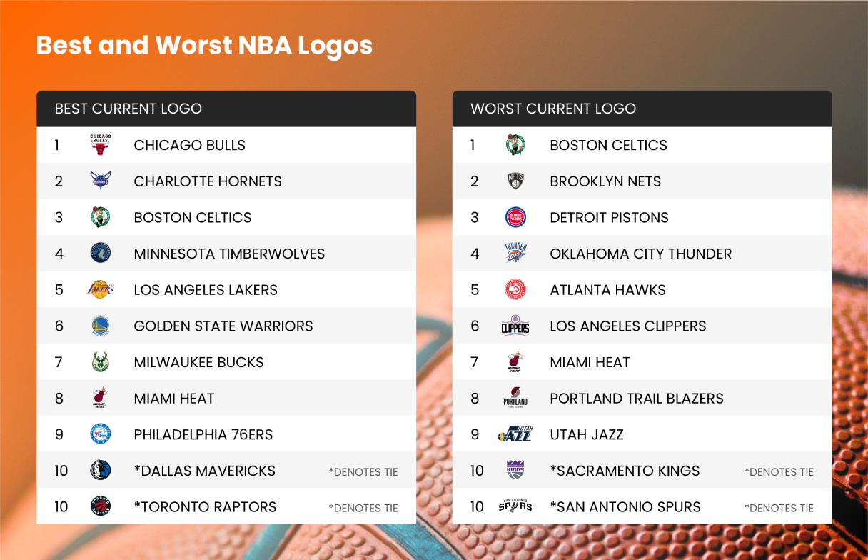
When it comes to the best NBA team logos, the Chicago Bulls top the list. It may be no surprise, as the team’s classic red and black logo is immediately recognizable across the world. Following the Bulls for best logo are the Charlotte Hornets, Boston Celtics, Minnesota Timberwolves and Los Angeles Lakers.
As for the worst logos, the Boston Celtics come in at number one. It seems many may be confused or have differing opinions about Lucky the Leprechaun as he ranks highly on both the best and worst logo list. The Brooklyn Nets come in second for worst logo, followed by the Detroit Pistons, Oklahoma City Thunder and Atlanta Hawks.
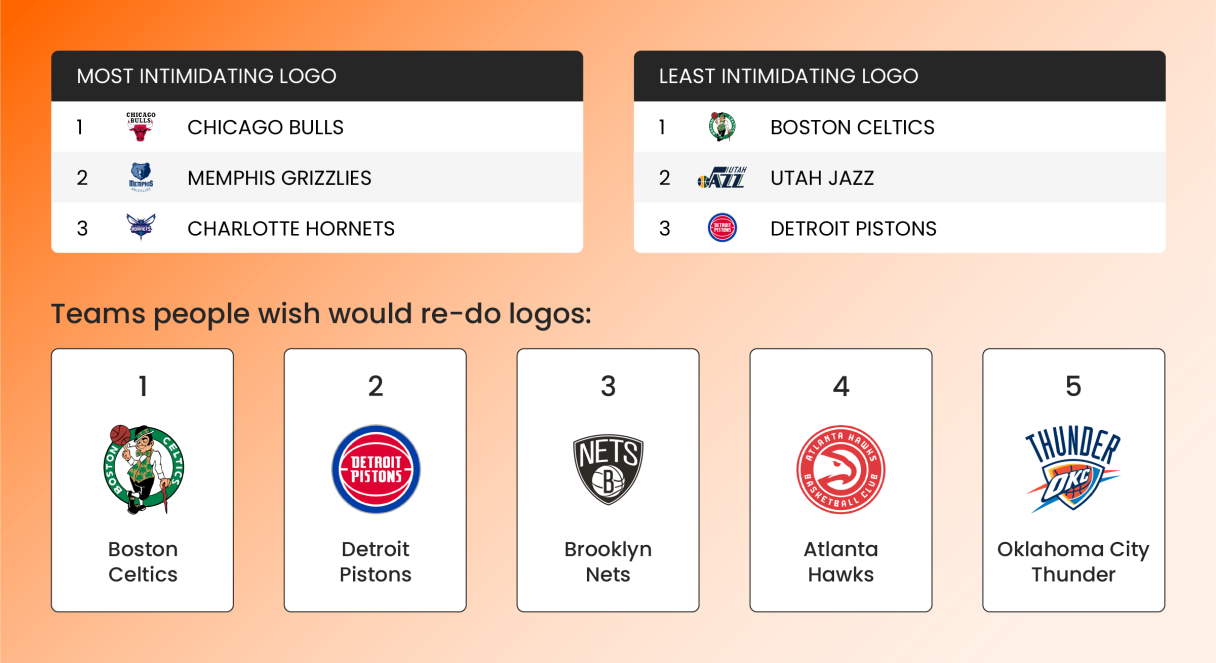
NBA teams and players can be intimidating, but what about logos? The Chicago Bulls once again take the top spot for the most intimidating logo in the NBA, with their angry red bull and menacing, bloody horns. Taking the number two spot for most intimidating is the Memphis Grizzlies, followed by the Charlotte Hornets.
Although people may have differing opinions on whether the Celtic’s logo is good or bad, there’s no debate that Lucky the Leprechaun is the least intimidating logo in the NBA. Following the Boston Celtics for least intimidating is the Utah Jazz, and the Detroit Pistons.
As for teams that fans wish would re-do the logos: the Boston Celtics rank first followed by the Detroit Pistons, Brooklyn Nets, Atlanta Hawks and Oklahoma City Thunder.
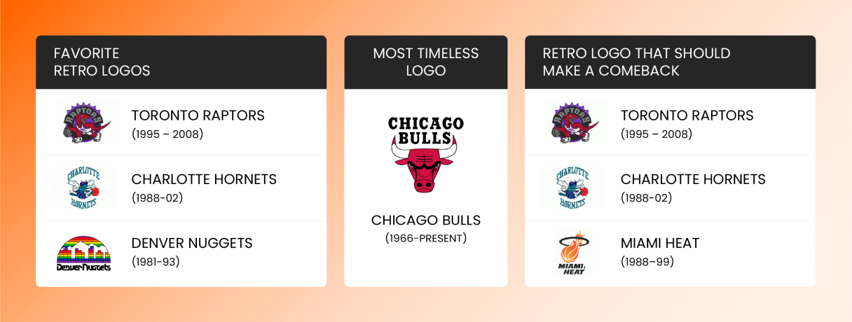
It may be no surprise, the Chicago Bulls take the title for the most timeliness logo. The current Bulls logo hasn’t changed since 1966, and since it tops the best logo list, there seems to be no reason to make changes anytime soon.
However, throughout the years, many other teams have updated or changed their logos. The favorite NBA retro logo among those surveyed is the Toronto Raptors logo from 1995-2008. Following the Raptors is the Hornet’s 1988-2002 logo, and the Denver Nuggets 1988-1993 logo.
As for which logo fans would like to see brought back, the 1995-2008 Raptors logo again tops the list. The second logo fans would like to see back in action is the aforementioned Hornets 1988-2002 logo, followed by the Miami Heat’s 1988-1999 logo.
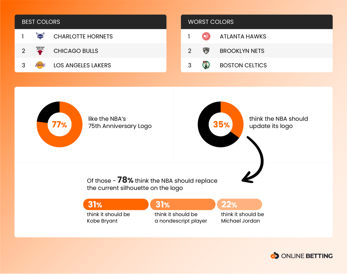
Colors can make or break a logo and the team’s branding. The Charlotte Hornets took the top spot for best colors. The unique white, teal, gray, and dark purple combination is favorite among fans. The red and black of the Bulls comes in second, and the Los Angeles Lakers’ purple and gold comes in third.
As for worst colors, the Atlanta Hawks rank first. It seems as though fans aren’t too keen on the red, green, and black color combination. The Brooklyn Nets take second for worst colors, and the Boston Celtics come in third.
With the NBA celebrating its 75th Anniversary season, a special logo was created to commemorate the milestone. Of those surveyed 77% say that they like the logo. When it comes to the NBA’s logo, 35% of people think it should be updated.
Of the 35% who would like to see a change in the NBA logo, 78% think the current silhouette should be replaced. Nearly one in three (31%) think it should be Kobe Bryant, 31% also think it should be a nondescript player, and 22% think it should be Michael Jordan.
Methodology: In March 2022, we surveyed 1,100 Americans to get their feedback on the best and worst logos in the NBA. Respondents were 48% female and 49% male, with an average age of 36.
Source: Retro logos credit to SportsLogos.net
Fair Use: When using this data and research, please attribute by linking to this study and citing Onlinebetting.com